
How to use EcoSpend
1. Getting started
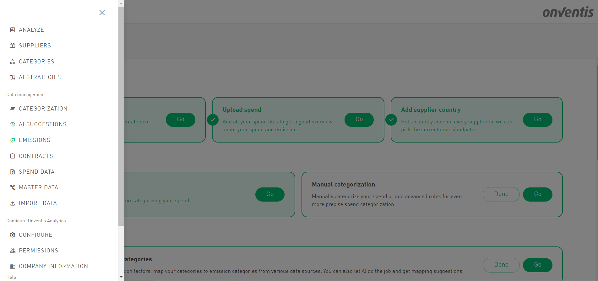
On our Emissions Page, you’ll find a detailed step-by-step guide to get good and accurate emission calculations. Each step can be marked as complete once it’s finished. Let’s dive into the individual steps!
Emissions Menu item

Emissions Cockpit
1.1. Complete category tree
Complete your spend category tree to include all categories you want to analyze. You can also create dedicated eco-categories specifically for emission analysis. For example, breaking down 'Transportation' into “Electric Vehicles," "Hybrid Vehicles”, "Rail Transport," "Air Freight" etc., may not be crucial for spend analysis but can provide more precise—and often lower—emission factors, ultimately reducing your reported emissions.
Further examples could be:
"Paper Products" divided into eco-categories like "Recycled Paper," "Sustainably Sourced Paper," "Standard Paper".
"Packaging" divided into the eco categories "Recyclable Packaging," "Compostable Materials," "Plastic Packaging".

Creation of Eco Categories
1.2. Upload Spend
Add all relevant invoices or purchase order spend files to ensure all of your spend is converted into emissions. This will provide a comprehensive overview of your spend and emissions.
1.3. Add supplier (production) country
From the uploaded spend file we are reading your suppliers and create them in the system. You can either manually enrich your supplier with a supplier (production) country or via an enrichment file. Putting a country on every supplier is crucial because only with a country we can retrieve pick the most accurate emission factor from our data sources.

Supplier (production) country
2. Categorize spend
2.1. AI categorization
Use our AI categorization to categorize as much spend as possible. Only categorized spend can be used for emission calculations. Run our AI to receive suggestions how to categorize your spend based on your supplier and GL account name.
2.2. Manual categorization
On top of AI categorization you can add more advanced rules on for even more precise spend categorization. Of course, you don’t need to use AI categorization and set up your own categorization rules manually.
Please note, that you will only get emissions calculated for special eco categories, if you categorize your spend into these categories.
2.3. Emission Mapping Overview
On the Emission Mapping page, you’ll find the emission categories from various sources displayed on the left.
We provide access to integrated datasources that can be used out of the box for easy emission calculations.
The following emission factor databases are available as “integrated dataset” (see next chapter):
Swedish Government (Miljöspendanalys) LCA from the year 2021
Available for all customers
Exiobase (version 3.9 from the year 2020)
Available as paid add-on
Each data source is highlighted in a distinct color, making it easy to differentiate mappings at a glance. AI-generated suggestions initially appear in the color of their respective data source. Once accepted or manually overridden, they turn green, allowing you to quickly identify the categories that still need mapping. Additionally, the column title includes a number indicating how many categories remain to be mapped.

GHG Protocol (Purple)
Mappings for the GHG Protocol are a bit special. These are not used to obtain an emission factor but are necessary for creating accurate emission reports. For the ESRS E1 report, all emissions must be reported in a standardized format using the 15 GHG protocol categories.
Swedish Government (Blue)
Each of your categories must be mapped to one of the 590 categories defined by the Swedish Government.
EXIOBASE (Yellow)
Each of your categories must be mapped to one of the 200 categories provided by EXIOBASE.
2.4. Map emission categories to your categories
To accept an AI mapping, simply click the colored pill. To remove a mapping, click the pill again to delete it, and the AI suggestion will reappear. For convenience, you can bulk accept all suggestions by clicking the "Apply All Suggestions" button at the bottom. If you prefer to start fresh, click "Delete All Mappings" to remove all existing mappings and return to the initial state, where AI suggestions are displayed for all your categories.
In general, the mapping on the lowest category level (leaf category) has the highest priority for emission factor retrieval unless there is a custom factor.
You can also map categories by simply dragging and dropping. Just drag a category from the left side and drop it onto your category on the right. The mapping will automatically align with the correct column, and the category will turn green to indicate it’s successfully mapped.
2.5. Add custom emission factors
If you want to use your own emission factors, you can add them at the category and supplier levels. These custom factors will override the integrated emission factors we provide, with supplier-level factors having the highest priority.
⚠️Important note: As emissions are measured in kgCO2e/ currency, every factor needs to have a currency maintained. Without a currency, a factor is not applied so pelase make sure that you specify the currency. Emission factors can be maintained manually or via import.
2.6. Set Emission Targets
You can set emission targets for all entities, with default target attributes available for categories called “CO2 Target for Category” and suppliers called “CO2 Target for Supplier”. Targets can be analyzed as metrics, allowing you to compare actual emissions against your goals and track progress in reducing emissions.
Targets are of the attribute type “integer,” meaning they are whole numbers without decimal places. Each target should be created separately for each year you wish to measure, such as a target attribute for 2025, 2026, and so on. Please note that the unit of measurement for targets is kgCO₂e.
Targets can be maintained manually bot also imported both on the supplier and on category level.
3. Analyze Emissions
Gain valuable insights into your emissions with our out-of-the-box emissions dashboard, featuring comprehensive and visually engaging charts. After completing the setup process outlined above, you’ll have instant access to key emissions data through our preconfigured dashboard. Here’s what you can explore on the Emission Analysis Dashboard:
KG CO₂ Equivalent by Category: The sunburst charts for emissions by category offer a dynamic, multi-level visualization that displays emissions across all levels of the category tree in a circular format. Each segment of the chart represents a category, with larger segments indicating higher emissions. This intuitive design allows users to quickly identify which categories contribute the most to emissions and to explore the hierarchical structure of emissions data in greater detail.
Spend vs. KG CO2E by Leaf Category: Analyze the correlation between your expenditure and emissions within detailed categories.
KG CO2E by Supplier Country: A world map that visualization displays the amount of emissions by country. With a single click, users can drill down into specific regions, such as the Nordics, Baltics, DACH, and Benelux, to explore emissions in greater detail.
KG CO2E and Spend by Leaf category: Scatter plot that visualizes emissions in relation to leaf category spend, making it easy to identify categories with disproportionately high emissions compared to their spend.
KG CO2E vs. Target by Leaf Category: Track progress by comparing your current emissions with your predefined reduction targets for each category.
KG CO2E by Supplier: Identify high-emission suppliers and prioritize engagement for sustainability improvements with those suppliers.
KG CO2E by Leaf Category and Year: This visualization highlights the trend for categories with the highest emissions over the past three years, allowing users to track how emissions by category have evolved over time. Helps to identify long-term patterns or improvements.
KG CO2E and Spend by Supplier: Scatter plot that visualizes emissions in relation to supplier spend, making it easy to identify suppliers with disproportionately high emissions compared to their spend.
KG CO2E vs. Target by Supplier: Assess how individual suppliers are performing against your emissions reduction goals.
KG CO2E by Supplier and Year: This visualization highlights the trend for suppliers with the highest emissions over the past three years, allowing users to track how emissions by category have evolved over time. Helps to identify long-term patterns or improvements.
With these insights at your fingertips, you’ll be well-equipped to identify key emission drivers, monitor progress toward sustainability goals, and make data-driven decisions to reduce your carbon footprint.

Emission Analysis space
As with all other spaces, you have the flexibility to customize the charts, dive deeper into the data, and share insights with others—such as the sustainability officer in your company. This allows for tailored collaboration and ensures that the right stakeholders have access to the information they need.
Your emissions analysis is not confined to this default space. You can create your own spaces tailored to your unique needs, combining all relevant data for a holistic analysis. This capability empowers you to explore your emissions from every angle, ensuring comprehensive insights and effective decision-making for your sustainability strategy.
4. Report Emissions
Besides the Emission Analysis Dashboard we also provide a default Emission Reporting Dashboard. This dashboard provides valuable information on the source and the coverage of the emission calculations. Further, if the mapping to the GHG Scope 3 categories to the own category tree was done, emissions can be analyzed and reported in the structure, required for CSRD Reporting.
Here’s what you can explore on the Emission Reporting Dashboard:
KG CO₂ Equivalent by Scope 3 GHG Emissions: Understand the distribution of emissions across different Scope 3 categories.
KG CO₂ Equivalent Coverage: Measure the completeness of your emissions data by comparing the availability of emission factors for your spend.
KG CO₂ Equivalent by Emission Factor Source: Provides insights on where the emission factors for calculation of emissions were retrieved: Category, Supplier, Exiobase or Swedish government.
KG CO₂ Equivalent Breakdown: A comprehensive Pivot Table that provides a detailed breakdown of emission calculations by year. It highlights the categories covered with a factor, those without one, and the sources of the factors used. This helps users clearly understand how the emissions were calculated and identify any gaps that need to be addressed.
For further readings you can check out our extensive How-to-Guide: