Onventis Analytics 2025.1
Welcome to Onventis Analytics 2025.1! The first release of 2025 starts off strong with a green twist!
In this release we are happy to introduce EcoSpend, our brand-new feature that lets you effortlessly analyze your Scope 3 GHG emissions using your spend data. No complex calculations, no guesswork—just clear insights into your carbon footprint, helping you make smarter, more sustainable procurement decisions. Ready to turn your spend data into climate action? Let’s go! 🍃 🌳
Besides our brand-new EcoSpend feature, we've packed this release with a few more goodies just for you! Check them out:
Country Map Chart
Chart Configurator
Outlined Icons
Company information page
EcoSpend: Empowering Sustainability Through Actionable Insights 🍃
In a world where sustainability is no longer optional, businesses must lead the way in addressing their environmental impact. That’s why we’ve developed Ecospend, a cutting-edge feature within Onventis Analytics, designed to help organizations measure and manage their Scope 3 greenhouse gas (GHG) emissions.
Scope 3 emissions are the hardest to track yet the most critical, as they cover the full value chain—from the raw materials suppliers use to the emissions generated by customers using your products. With EcoSpend, we’ve turned complexity into clarity by leveraging your existing spend data, enriched with carbon metrics. This means you can track, report, and reduce your emissions effectively while unlocking a host of strategic, operational, financial, and reputational benefits.
💡 If you are interested in this feature, please contact insidesales@onventis.de for further information
Why Does This Matter?
1. Stay Ahead of Regulations
The clock is ticking for mandatory carbon reporting. The Corporate Sustainability Reporting Directive (CSRD) will require around 50,000 EU companies (and 15,000 in Germany) to disclose detailed sustainability data starting in 2025. Swedish companies are even earlier adopters, with national laws already in place.
Whether you’re managing a large enterprise or an SME, Ecospend positions your organization to meet these requirements effortlessly, ensuring compliance without the headaches.
2. Gain a Competitive Edge
Reducing emissions isn’t just about saving the planet—it’s also about saving money and building your brand.
Financial Wins: Identify inefficiencies, reduce waste, and lower costs.
Market Opportunities: Cater to the growing demand for sustainable products and services.
Investor Appeal: ESG-focused investors are watching, and companies that act now may unlock favorable financing terms.
3. Drive Innovation and Collaboration
With detailed insights into your carbon footprint, you can make smarter decisions about sourcing, product design, and logistics. Engage your suppliers to create collective impact and inspire innovation that benefits your business and the planet.
4. Build Trust and Loyalty
Consumers and stakeholders demand transparency. By reporting Scope 3 emissions, you demonstrate accountability and industry leadership. The result? Stronger stakeholder trust, enhanced brand reputation, and customer loyalty that lasts.
Why Scope 3?
Scope 3 emissions encompass everything beyond your direct control, making them the most challenging—and impactful—to address. These emissions span your entire value chain, from raw materials to end-of-life disposal, making them the most significant contributors to greenhouse gases. Yet, despite their importance, Scope 3 emissions are notoriously difficult to measure. Why? They fall outside your direct sphere of influence, with limited data availability and a lack of standardized methodologies. This is where EcoSpend shines, turning these challenges into opportunities.
By addressing Scope 3 emissions, you’re not just complying with regulations or improving your bottom line—you’re taking meaningful steps to combat climate change and contribute to a sustainable future.
Let’s redefine what’s possible in procurement and sustainability—together. 🌟
What you can expect?
✅ Simplified Scope 3 Calculations
Effortlessly map categorized spend data to accredited emission factors, ensuring precise CO₂ equivalent calculations based on the spend-based methodology with no manual effort.
✅ Spot Emission Hotspots
Identify key contributors to your Scope 3 emissions by analyzing categories, suppliers, or subsidiaries, enabling targeted reduction strategies.
✅ Customizable, Transparent Methods
Use AI to align spend categories with emission factor data or refine accuracy with custom category or supplier-specific inputs.
✅ Support for reliable and compliant Reporting
Deliver transparent, GHG Protocol-aligned reports supported by a full audit trail, including emission factors, sources, and validity periods.
How to do the Setup?
Accurate emission calculations start with a solid setup. Our Emissions Page provides a step-by-step guide to help you through the process. As you complete each step, mark it as done and move on. Let's get started!
For a detailed instructions please have a look here: How to use EcoSpend
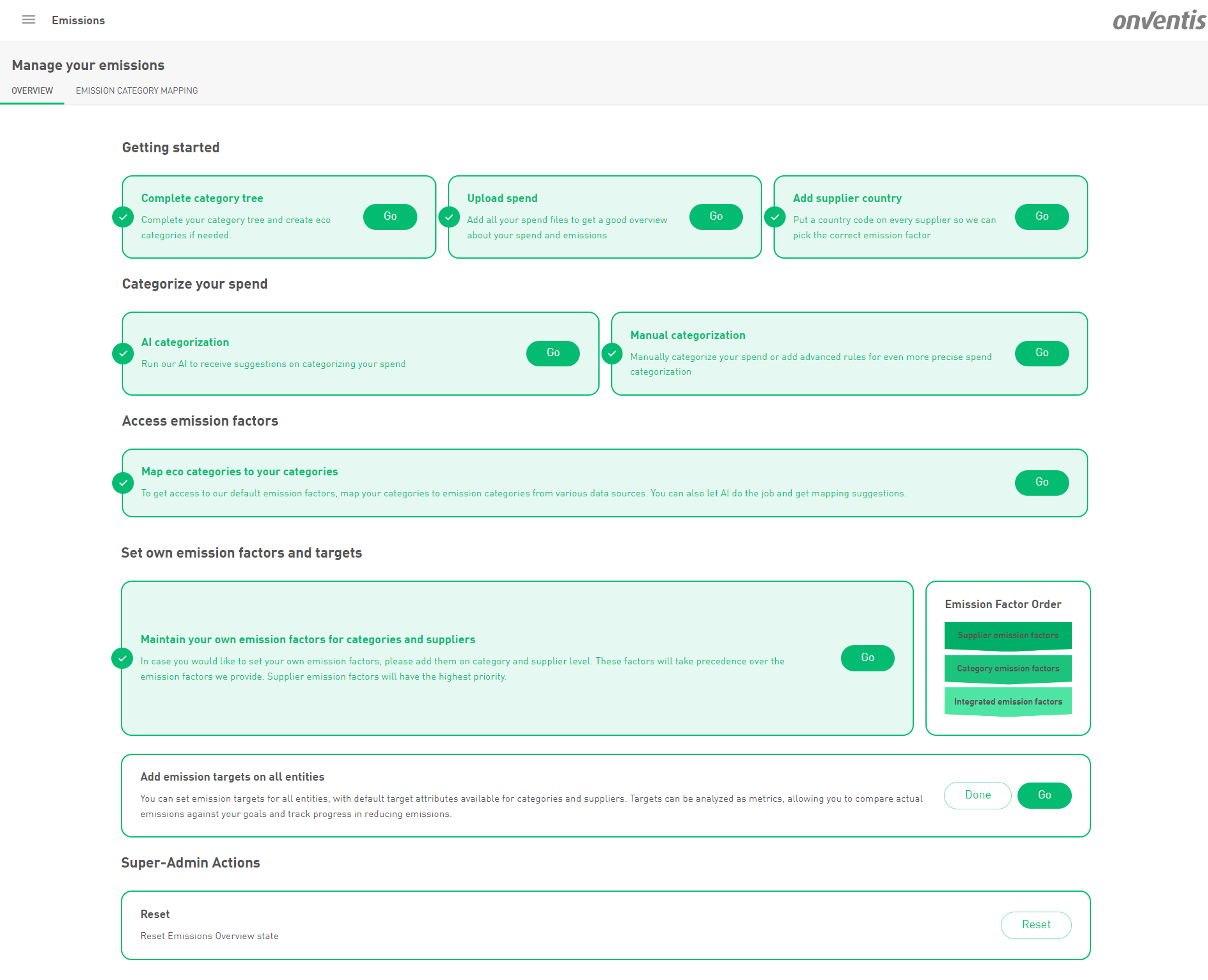
1. Complete Your Category Tree
Your spend category tree is the backbone of your emissions analysis. Make sure it includes all relevant categories, and consider creating dedicated eco-categories for more precise emission factors.
For example, instead of a broad "Transportation" category, break it down into subcategories like Electric Vehicles, Hybrid Vehicles, Rail Transport, and Air Freight. While these distinctions might not matter much for spend analysis, they can significantly improve your emission calculations—potentially even lowering your reported emissions.
Other examples:
Paper Products: Split into "Recycled Paper," "Sustainably Sourced Paper," and "Standard Paper."
Packaging: Divide into "Recyclable Packaging," "Compostable Materials," and "Plastic Packaging."
2. Upload Your Spend Data
To ensure all spend is converted into emissions, upload all relevant invoices or purchase order spend files. This will provide a complete picture of both your spend and emissions.
3. Enrich Your Supplier Data
3.1. Add Supplier (Production) Country
Once you upload spend data, we automatically create supplier records in the system. However, you’ll need to add the production country for each supplier—either manually or via an enrichment file.
This step is crucial! Without a country assigned, we can’t select the most accurate emission factor from our data sources.
One additional benefit, with the supplier country all set, you're all geared up to dive into our shiny new Country map chart
4. Categorize Your Spend
4.1. AI Categorization
Leverage our AI-powered categorization to classify as much spend as possible. Only categorized spend can be used in emission calculations. AI will suggest categories based on supplier names and GL accounts, helping you streamline the process.
4.2. Manual Categorization
Want even more precision? Add your own categorization rules on top of AI categorization—or skip AI altogether and categorize manually.
⚠ Important: Emissions will only be calculated for eco-categories if your spend is assigned to them.
5. Map Emission Categories
5.1. Emission Mapping Overview
The Emission Mapping page displays emission categories from multiple sources, color-coded for easy reference. AI-generated suggestions initially appear in the source’s color. Once accepted or manually adjusted, they turn green—helping you track progress at a glance.
The column title also shows a number indicating how many categories still need to be mapped.
5.2. Map Categories
Click the colored pill to accept an AI-generated mapping.
Click again to remove a mapping (AI suggestions will reappear).
Bulk actions: Use "Apply All Suggestions" to accept everything at once or "Delete All Mappings" to reset and start over.
Drag & Drop: Move categories from the left panel to your categories on the right for quick mapping.
🔎 Priority: Mapping at the lowest category level (leaf category) takes precedence—unless overridden by a custom emission factor (see section 6).
5.3. Datasources and their colour code
GHG Protocol (Purple): Used for standardized reporting (e.g., ESRS E1) but does not determine emission factors.
Swedish Government (Blue): Requires mapping to one of 590 predefined categories.
EXIOBASE (Yellow): Requires mapping to one of 200 predefined categories.
Accept AI mapping suggestions
Manual mapping
6. Add Custom Emission Factors
Want even more control? Add your own emission factors at the category and supplier levels. Supplier-specific factors take the highest priority, overriding system-provided factors.
Ensure all custom factors include the correct currency. Without a currency selected, an emission factor is not valid.
🚨 Heads up! Custom emission factors are a powerful tool, but with great power comes great responsibility. If you set a custom factor, it will override the default system factor—so make sure your data is accurate! Also, don’t forget to keep your custom factors updated to reflect the latest sustainability benchmarks.
💡 Pro Tip: If a child category is missing a custom emission factor but its parent has one, the parent’s factor will automatically apply to all child categories without their own custom factor. This means that even if a leaf category is linked to an integrated emission category, it will still inherit the parent’s factor instead of using a system-provided one.
So if you want to ensure your categories use emission factors from our integrated data sources instead, avoid assigning custom factors to parent categories.
7. Set Emission Targets
Define emission reduction targets for your organization.
Category-level targets: "CO₂ Target for Category."
Supplier-level targets: "CO₂ Target for Supplier."
Targets can be tracked as metrics, allowing you to compare actual emissions against goals over time. Since targets are whole numbers (integers), they must be set separately for each year (e.g., 2025, 2026, etc.).
⚠ Unit of measurement: Targets are always in kgCO₂e.
8. Analyze your Emissions
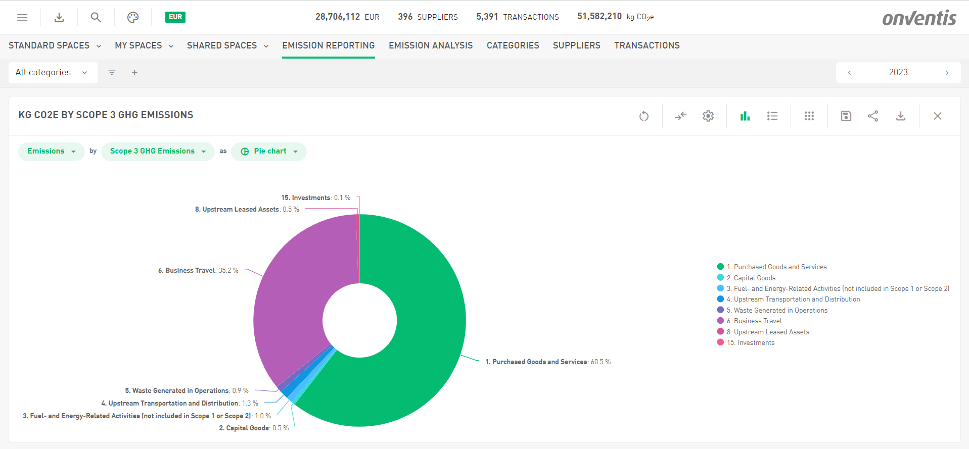
Unlock powerful insights into your emissions with our sleek, ready-to-use “Emission Analysis” and “Emission Reporting” dashboards! Packed with visually engaging charts and all the key metrics you need, it transforms your hard work into meaningful data. Once you've completed the setup, you'll have instant access to an intuitive overview of your emissions—so you can track, analyze, and take action with confidence.
New in Analyze 💸
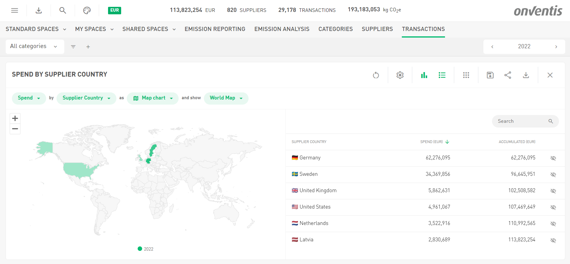
Unveiling the Country Map Chart! 🌍
It’s here, and it’s fabulous—our brand-new map chart is ready to revolutionize how you analyze your data! Want to explore metrics like spend, emissions, or transactions by supplier or production country? Now you can, with just a few clicks!
Simply choose the metric you’re curious about (e.g., emissions), pick "Supplier Country" or "Supplier Production Country," and voilà—the map chart is automatically selected and ready to roll. But wait, there’s more! With a single click, you can effortlessly zoom from a global view to key regions like Benelux, Nordics, DACH, or the Baltics. Need to dive even deeper? The chart’s zoom functionality lets you focus in on the finer details.
To power this feature, we’ve introduced two shiny new built-in tag attributes: Supplier Country and Supplier Production Country, covering all ISO 3166 countries. No need to stress about your existing data—if you’ve already entered supplier countries using two-letter codes, they’ll seamlessly migrate to the new attributes.
And why the addition of Supplier Production Country, you ask? It’s the ultimate tool for more precise emissions analysis—because where something is made truly matters. (For more details, check out Chapter 1.)
Your map chart adventure awaits.
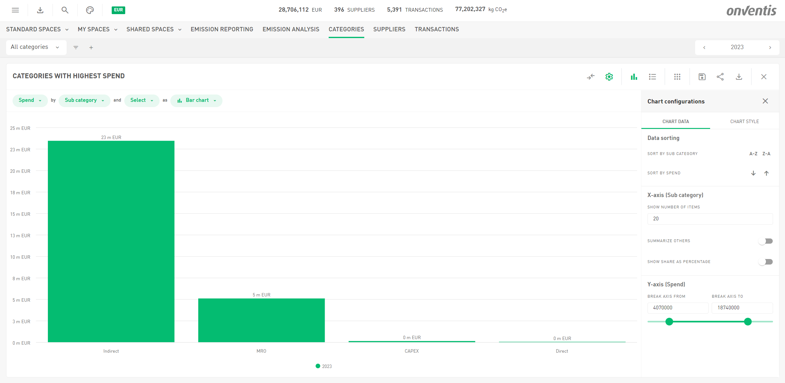
Meet Your New Chart Configurator! 🎨
As our feature set continues to grow, we’re committed to keeping your user experience top-notch. That’s why we’ve tidied up our icons and are thrilled to introduce the all-new chart configurator!
Now, you can find everything you need to tweak your chart—whether it’s the data or the styling—all in one place. Just click the cogwheel icon in the toolbar above any chart to access it.
Here’s the best part: every change you make, from adjusting the data to fine-tuning the look, is instantly visible. No guessing, no delays—just a seamless, intuitive way to see exactly how your changes transform your chart.
Happy customizing!
Other Improvements
A Fresh New Look: Sleek Outline Icons!
If you take a closer look, you might notice something different—yep, the icons got a makeover! We’ve swapped out the filled icons for sleek, modern outline icons. A subtle change, but outline icons create a cleaner, more lightweight look, improve readability, and blend more seamlessly with different UI elements. Plus, they add a touch of modern elegance to your experience.
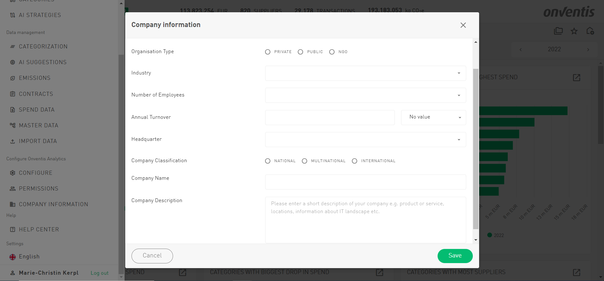
Meet the 'Company Information' Menu!
We’ve just added a brand-new menu item—Company Information—ready to give your experience a boost! Click on it, and you’ll land on a new page where we’ll ask for a few details about your company. Why? Because this info helps us fine-tune our features to better fit your company size and industry, giving you a more tailored experience. By adding this background, you'll also unlock smarter, more accurate features like AI-driven suggestions that are spot-on. Ready to make your experience even more personalized? And stay tuned—one of these exciting new features will be making an appearance very soon!