Change or Add Attributes
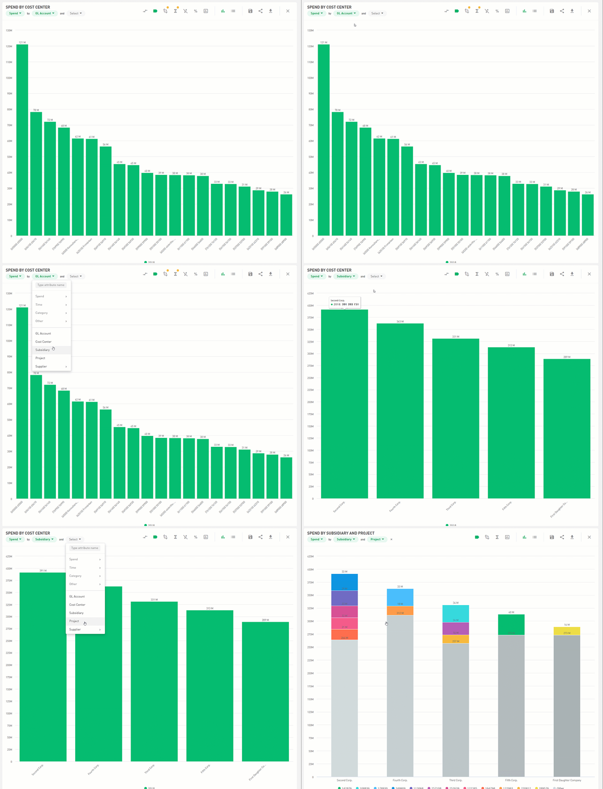
If you want to change or add attributes to a graph, you can click the attribute filter in the upper left corner.
Numbers to Percentages
Click on the percentage icon on the graph, and it will display percentages instead of absolute numbers.

Drill-Down Information Card
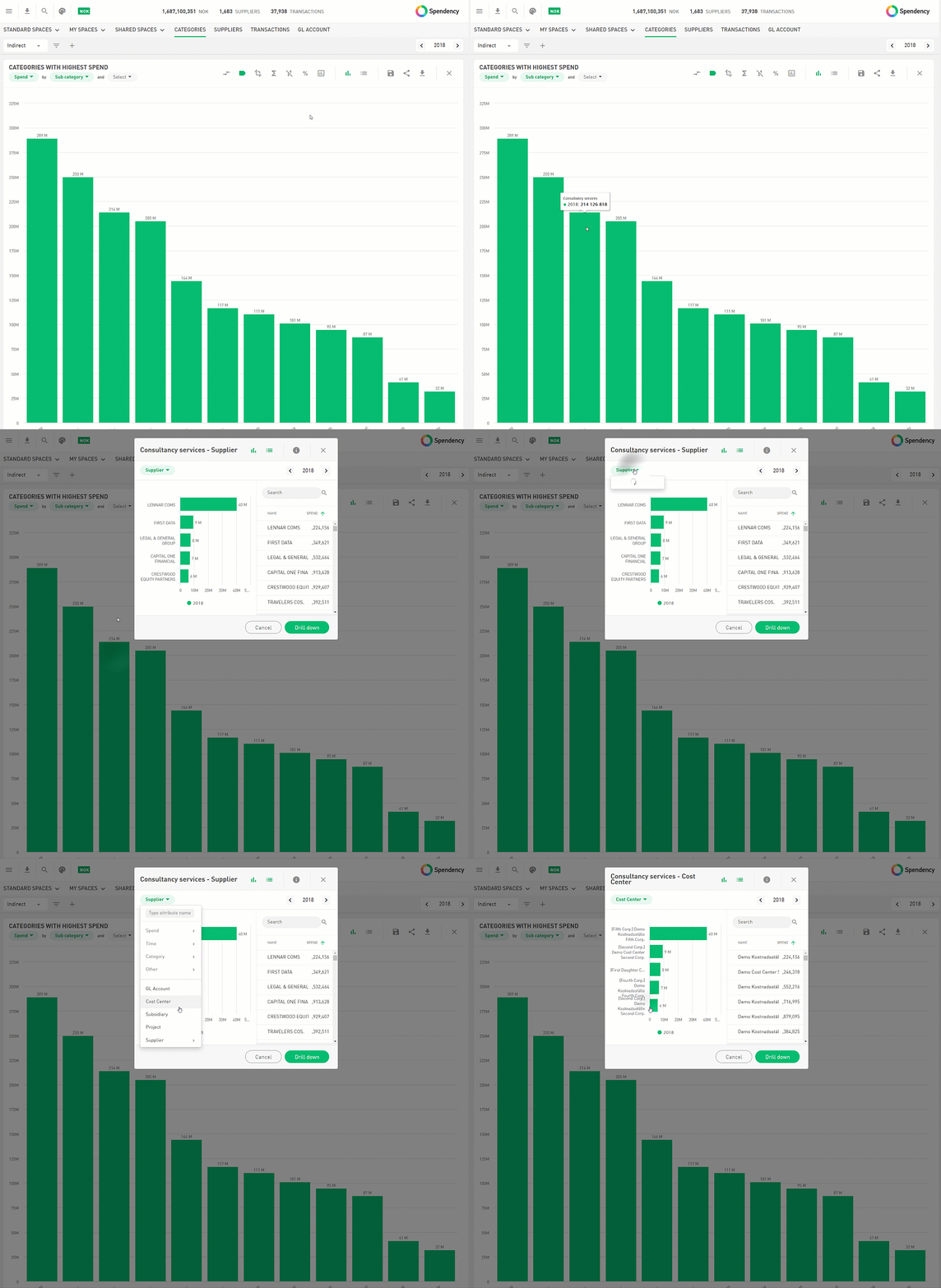
When analyzing a chart, you can click on a value to view the underlying information. On the information card, you can switch between different variables to understand the data from different perspectives.
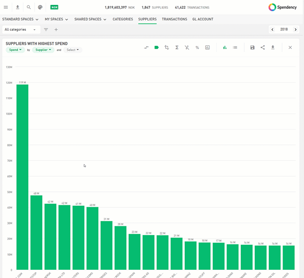
When analyzing specific suppliers, you can click on the bar to access the supplier information card. On the supplier card, you can see:
- A spend overview distributed per year
- Comments from other Spendnecy users
- See who buys the most from the supplier
- Categorization rules Suppliers who have become normalized under that supplier
- Contracts
Corp Axis
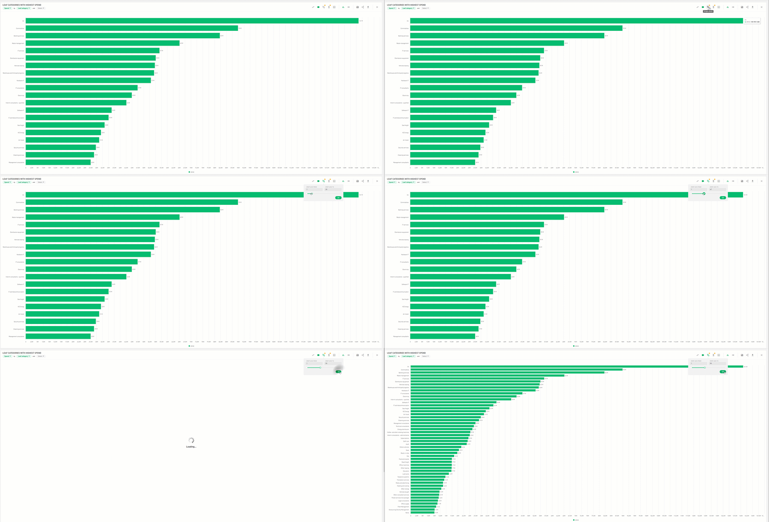
If you want to increase or decrease the number of values displayed on a graph, you can click on the corp axis icon.
Display Table
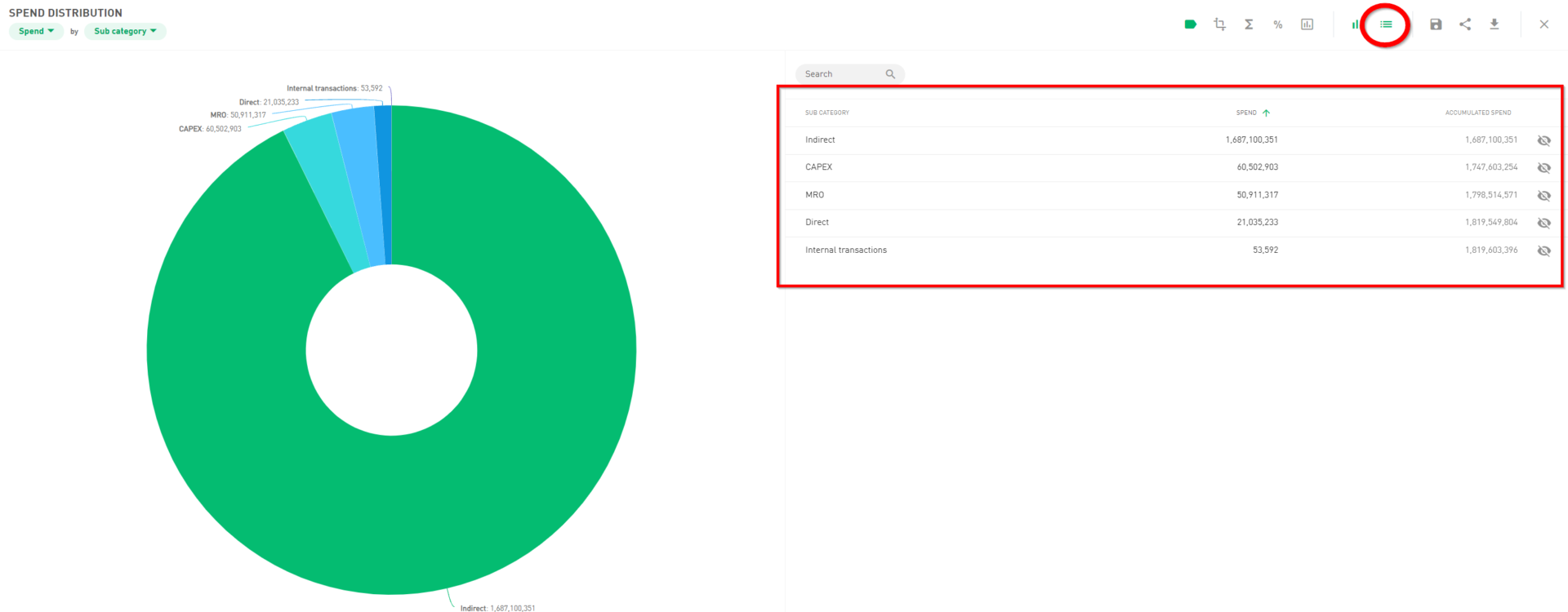
If you want to display the underlying data of a graph, you can click on the table icon:
Compare Periods
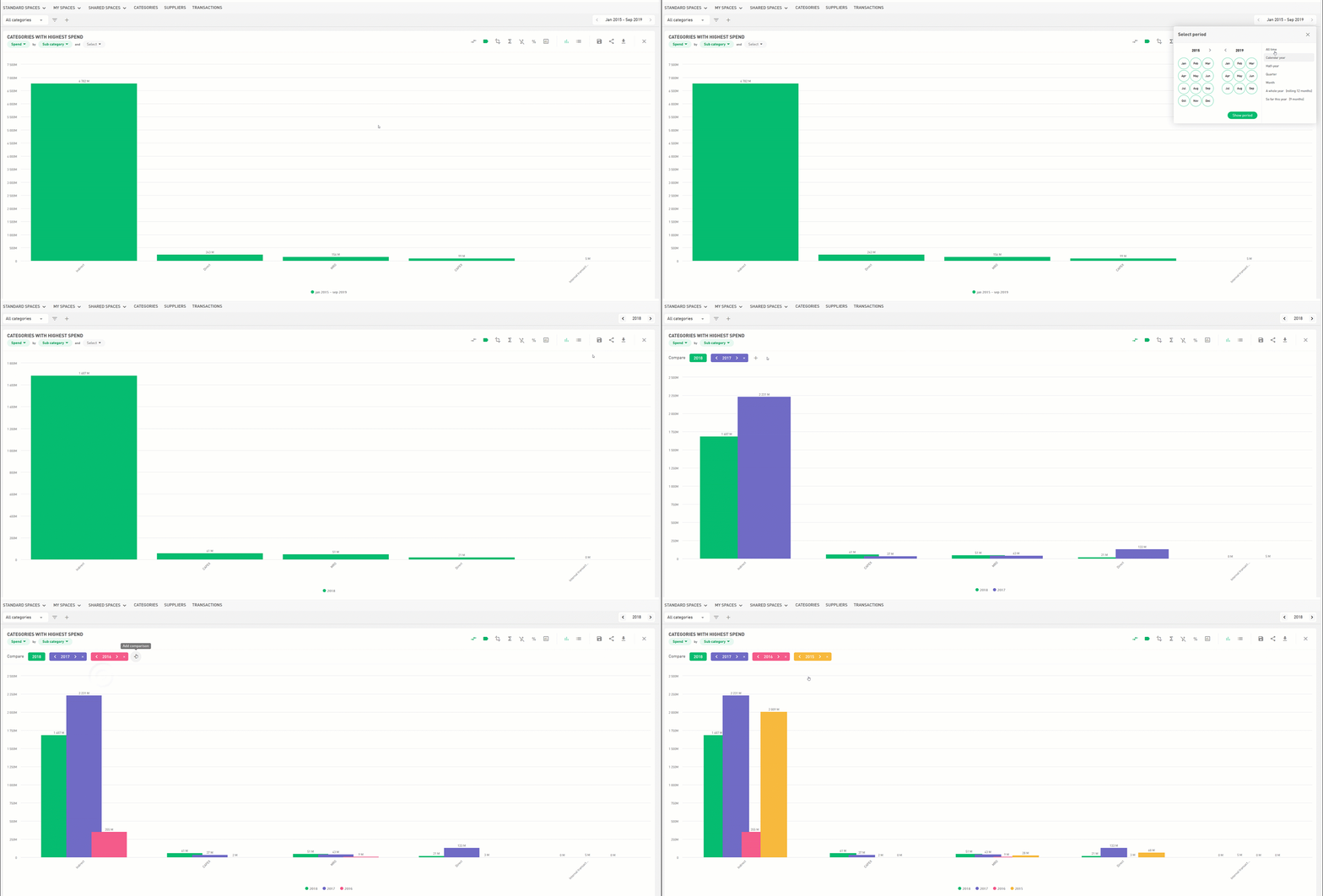
To compare different periods in a graph, press the comparison arrows. The system will add a bar with the previous year or period based on the selected date in the system.
Share Graphs
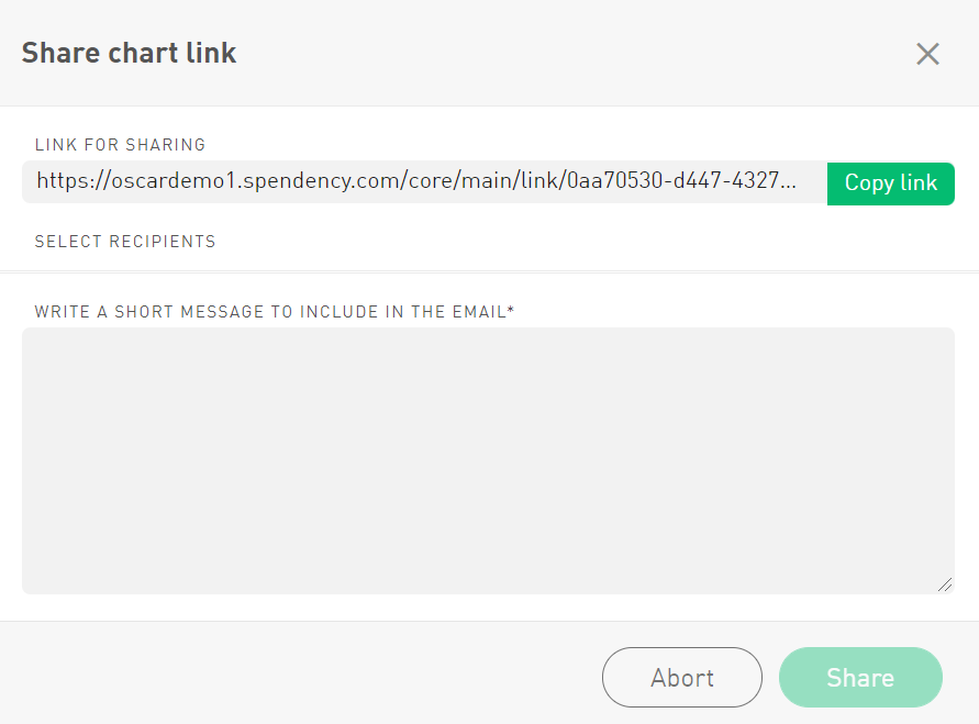
In Spendency, you can share graphs with other users. This is done by clicking on the share icon at the top of the graph’s menu bar:

The graph can be shared via a URL link or by email to the existing users. It is also possible to write a shorter text that is included in the email.
Change Charts
In Spendency, you can change the layout of an existing chart. To change the graph, click on the bar chart icon located on the menu at the top of the chart.

There is eight graphs to choose from:
- Pie chart
- KPI/Circle
- Bar chart
- Waterfall diagram
- Horizontal bar chart
- Line chart
- Surface diagram
- Pivot table